
Notes on the dynamics of subsequent epidemic waves
[This is a technical post]
There is a common misunderstanding that the social benefits of a share of the population acquiring immunity to a disease kick in only once a critical mass is reached (60% or 70% have often been quoted in the context of this new coronavirus).
In fact, the social benefits start accruing from the very start of an epidemic and can be significant even when a relatively small share of the population has acquired immunity.
As a result, subsequent waves of the epidemic may be somewhat easier to manage, with a slower build-up of cases for any given level of social distancing and effectiveness of test, trace and isolate (TTI) processes. Equivalently, it may be possible to suppress subsequent waves with less social distancing than was the case during the initial wave – with this effect being even stronger if the effectiveness of TTI also improves.
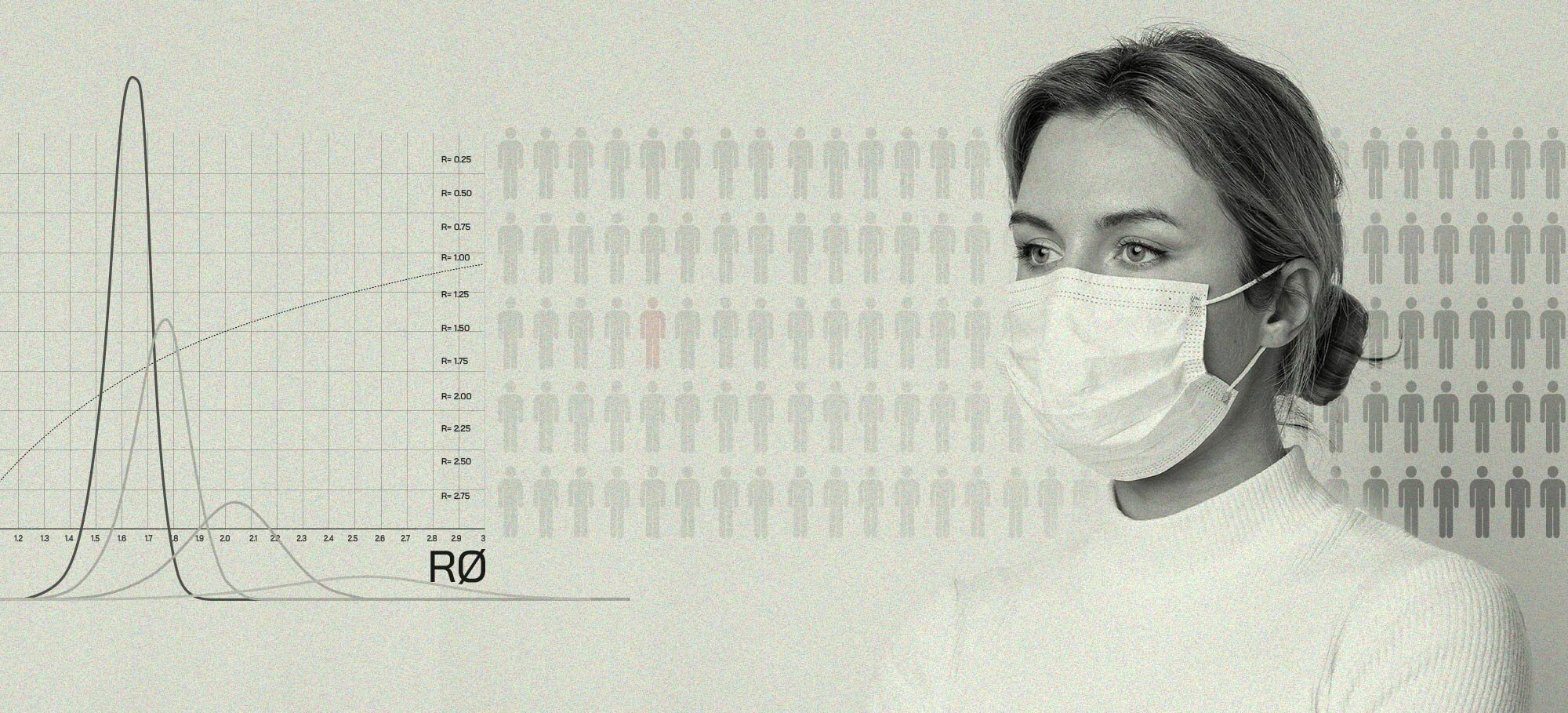
A tale of two Rs
We first need to get through some (very light) theory, starting from defining two widely misunderstood terms [1], R and R0:
R refers to the expected number of people one infected person will pass the virus on to. So, if on average each infected person infects two people, R is equal to 2.
R0 refers to the expected number of people one infected person will pass the virus on to in a population where everyone is susceptible to infection.
R depends on two things: R0 and the % of the population who are not susceptible to the disease.
R is not constant over time or across populations: it changes as R0 changes, but it also goes down as more people develop immunity, even in the absence of any other changes. [2]
Keep overall social behaviour or the effectiveness of TTI (both reflected in R0) fixed, and R will come down on its own as the % of the population infected – and subsequently immune [3] – increases. Or take measures to lower R0 – e.g. through better TTI or through more social distancing – and R will come down alongside it.
What’s in a number?
R=1 is the threshold at which the number of coronavirus cases is neither increasing nor decreasing. When R is below 1, the virus is dying out as fewer people carry it in each successive ‘generation’ of transmission.
An oft-quoted estimate is that 60% of the population would likely need to be infected for R to fall below 1. As can be seen in the graph below, this is true for an R0 of 2.5 (which was many experts’ central estimate of R0 at the start of the post-China stage of the epidemic).
It is also clear from the graph below that it possible for R to be below 1 with a much lower number of people infected – in fact even with 0% of the population being immune. This is what places like New Zealand and South Korea have done: through effective TTI, voluntary changes in behaviour and/or introducing social restrictions, they have reduced R0 below 1, also reducing R below 1 as a result.
Places like New York and London have also attained R<1 at the time of writing – the virus is becoming less prevalent – but due to the fact a substantial share of the population has already contracted the virus and recovered it is possible their R0 remains above 1.
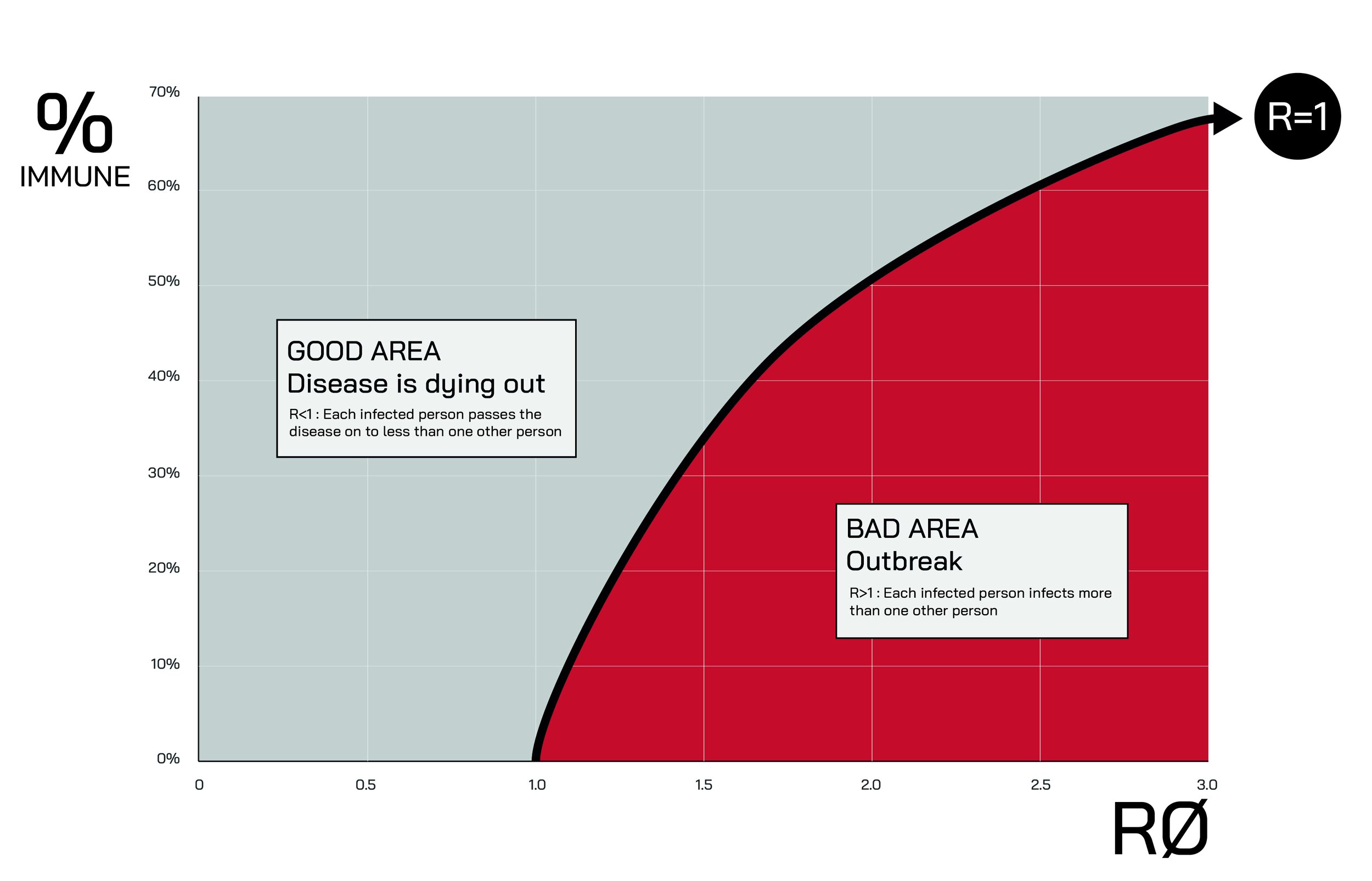
Solely focussing on the threshold where R turns negative is a misleading way of looking at the impact of higher levels of immunity in the population – and it is a common misconception that social benefits only kick in once a critical mass has been attained.

The figure below shows a simple example. Let’s assume R0=2 [4]. R is equal to 1.75 when 13% of the population is immune, and it is equal to 1.5 when 25% is.

But what does it matter if R is 1.75 or 1.5 rather than 2? See below:
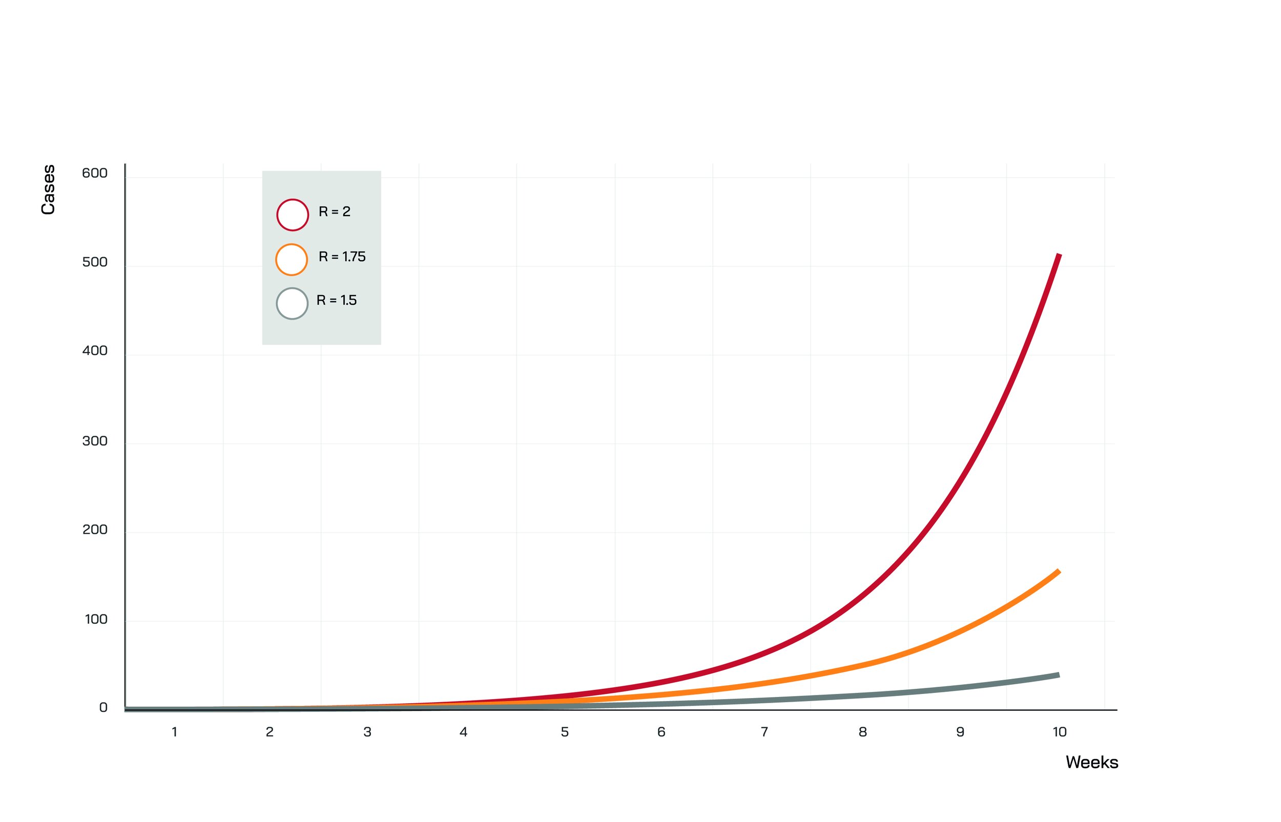
Again, in all three scenarios above R0 is identical – in other words, there is no difference in behaviour, social distancing restrictions and TTI effectiveness.
The graph below shows results from a simple model [5] for a theoretical total population of 10 million and R0=2. The only parameter that differs between the scenarios shown is the % of the population that is deemed to be immune at the start of the simulation.
Even small differences in the share of the population that has immunity have a pronounced impact on both the peak and the speed of the epidemic ‘wave’.
In this calibration, with 0% immune the peak is almost twice as high compared to a scenario where 15% of the population is immune at the start of the wave, and five times as high compared to a starting immunity level of 30%.
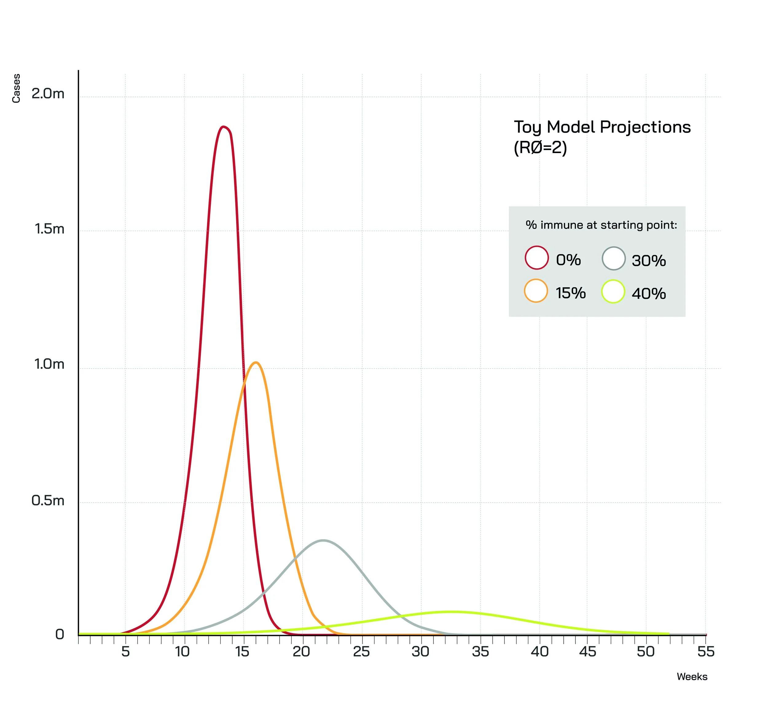
Of course, the height of the peak may not be the most relevant metric – the mere possibility of the ‘red’ and ‘yellow’ peaks would lead most societies to adopt measures (whether government-imposed or voluntary) to suppress them before they are ever reached.
More to the point, the higher the level of immunity at the start of the ‘wave’, the later the peak, and the gentler the slope – hence much more time to react if a ‘wave’ starts building up.
With no-one immune (red line), the growth of the virus is explosive – and things get out of control very quickly. With 15% immune (yellow line) the gradient is much lower, and even more so with the percentage immune at 30% (grey line) or 40% (green line).

Notes:
[1] There is no end to the confusion regarding these two terms, and people often use R0 when they really mean R (e.g. this BBC video and this Financial Times article, though there is no shortage of examples on this – including from experts).
[2] It is important to note that neither R nor R0 can be estimated very precisely, not least because the exact number of cases at any given point in time is not known with certainty. That said, a dwindling number of cases points to R being below 1 during the period in question.
[3] There have been voices (most notably the WHO) pointing out we do not yet have definitive proof that infected individuals become immune to the disease. That said, given the available evidence it is likely that people who recover from Covid-19 go on to develop at least a very substantial measure of immunity.
[4] My guesstimate is that R0=2 (or lower) may be achievable with relatively minimal, voluntary changes in behaviour plus a bit of (not necessarily world class) TTI. In other words, I think R0=2 or lower could be consistent with behavioural changes that would be sustainable for many months and a level of TTI effectiveness that would be achievable by many countries, particularly in Europe.
[5] This is a toy model and not meant to be taken too seriously in terms of its specific quantitative predictions or even the projected shape of the epidemic curve. That said, the general points discussed here remain valid and would likely be replicated by most standard models.