Our research is of exceptional quality. In its presentation, we aim for the utmost clarity. This applies whether we are producing a policy report, academic paper, brochure, or other publication. Infographics, maps, cover art and more are created by in-house designers working closely with our analysts. This ensures our in-depth understanding of an issue is reflected on every page.
Combining substance and style, we ensure that all elements are balanced to achieve clear and effective communication.
Below are some of our key capabilities.
Copywriting and editing
At Alma Economics, everyone is a writer. But even great writers benefit from having a great editor.
Our Comms team includes seasoned writers, proofreaders, and journalists who have honed their trade writing and editing for major international news outlets and non-fiction publishers. They bring this experience to bear in refining our outputs, ensuring all copy is crisp and clear.
Accessible and easy read publishing
We work hard to ensure that our work is as accessible as possible. In font and colour selections, the use of alt text, and more, we follow the most up-to-date best practice guidelines to ensure our work is as easy as possible to explore for those with visual impairments.
In addition, we have experience producing easy read versions of reports to make them accessible for those with learning disabilities or difficulties processing written information.
Typesetting
Our reports adhere to the highest publishing standards, following best practices in typography. Findings are clearly laid out, with clear guidance provided for easier navigation of each section.
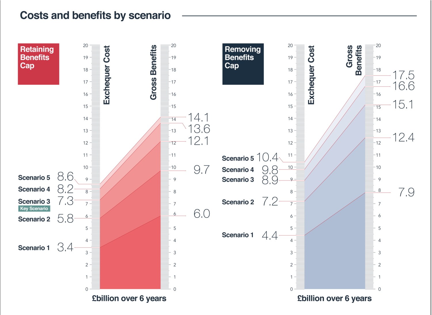
Data visualisation & infographics
Charts, graphs, and diagrams are vital to our communication. Our in-house design team operates as an extension of our Research and Technology teams, transforming data and analysis into clear, engaging, and accurate visuals.
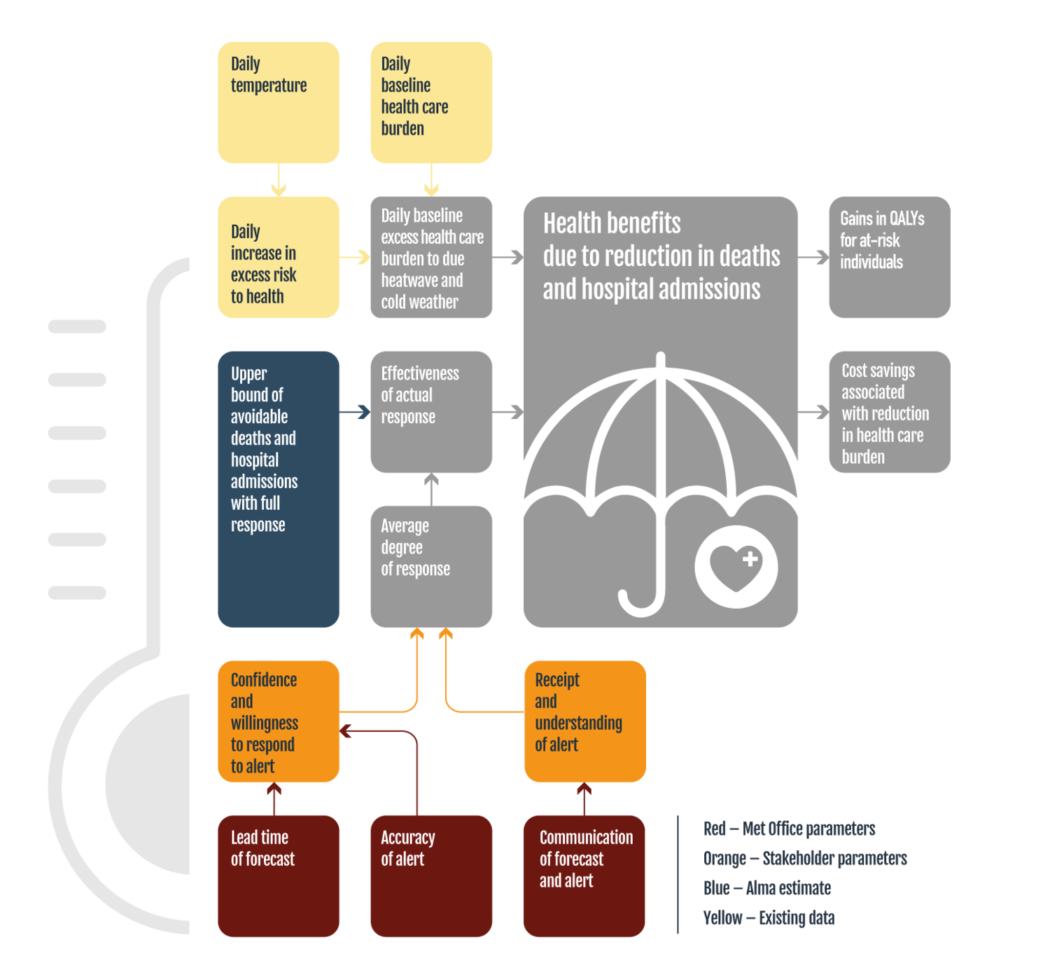
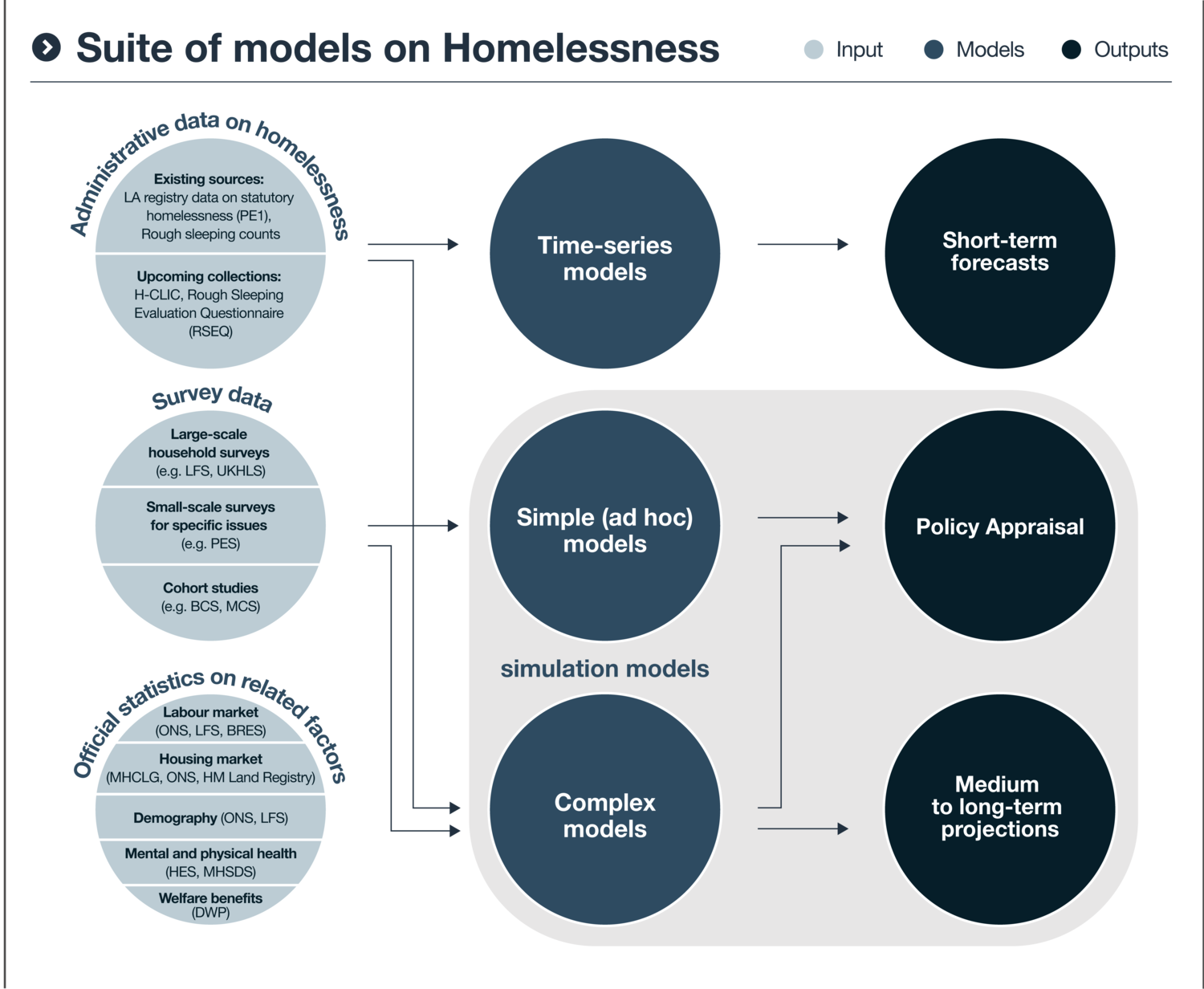
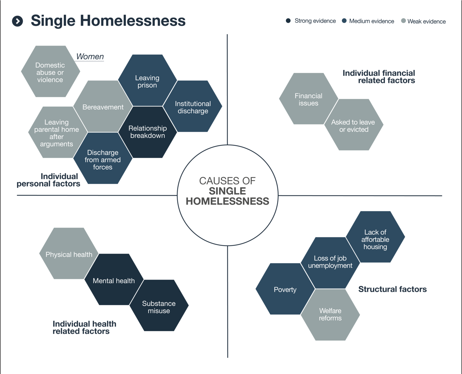
Systems mapping
The problems we work on are multifaceted. To provide effective solutions, we need to understand how different elements – people, organisations, causes and effects – interact with each other to impact the wider system.
Clear, concise systems maps allow us to identify difficult-to-discern patterns and point to effective solutions.
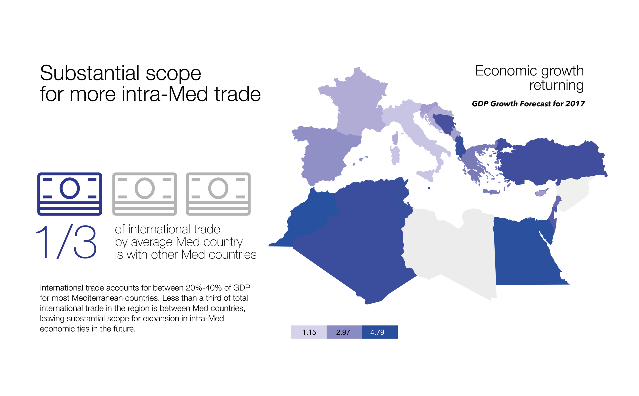
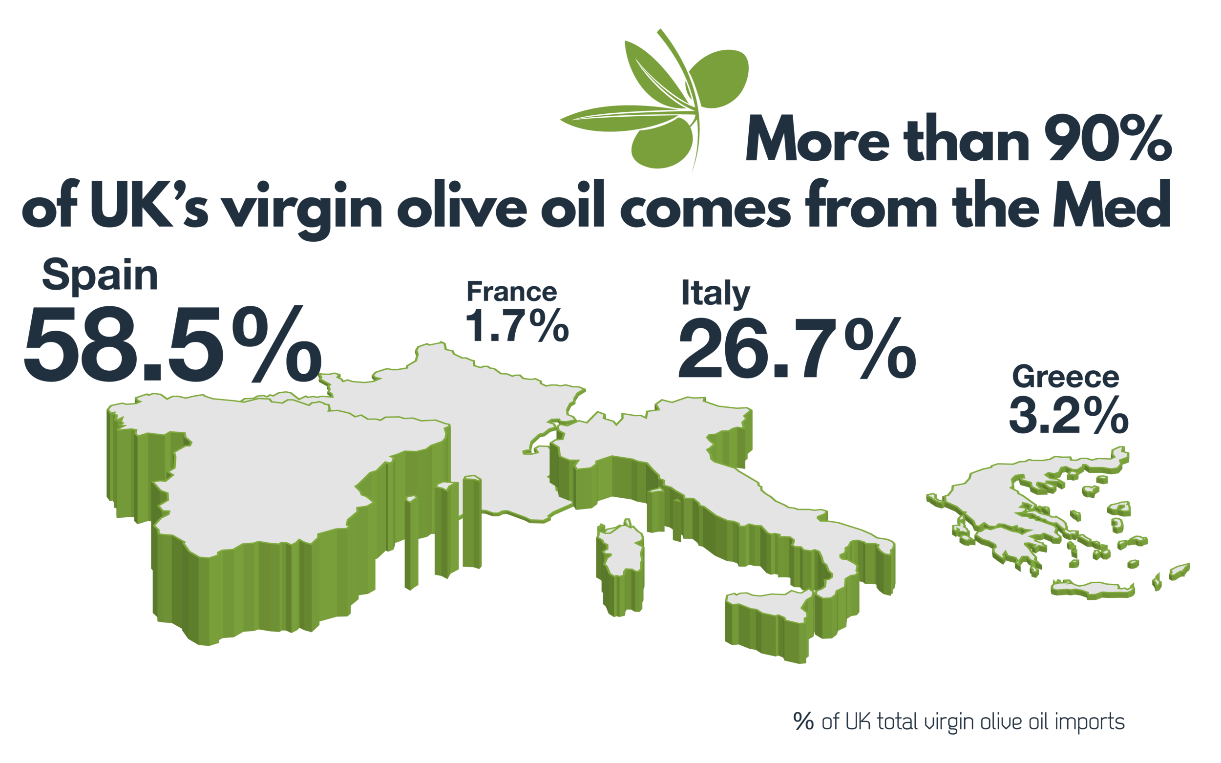
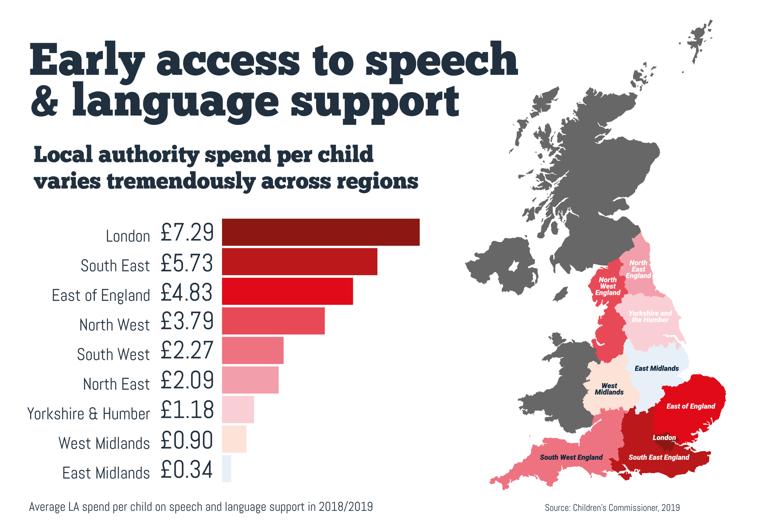
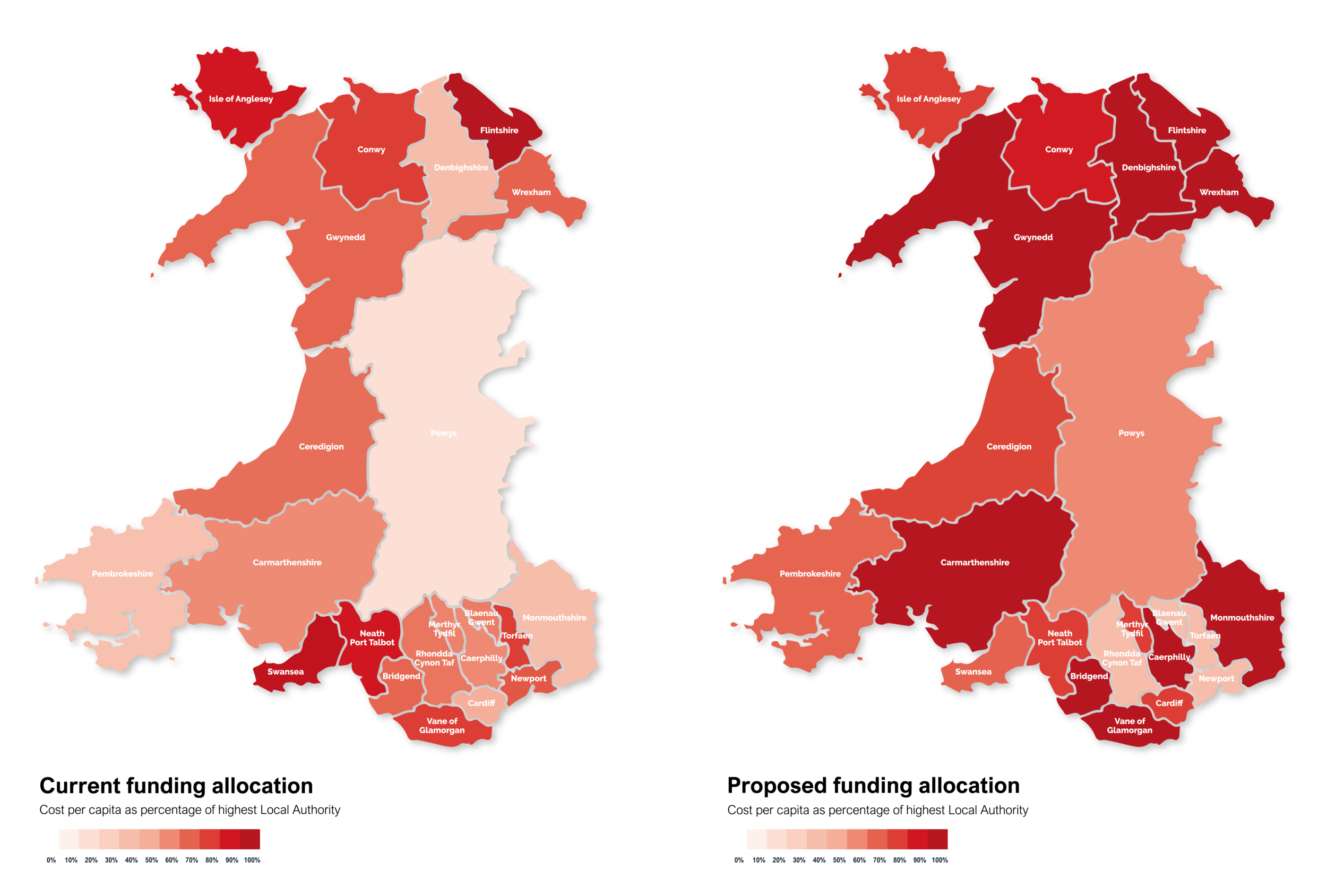
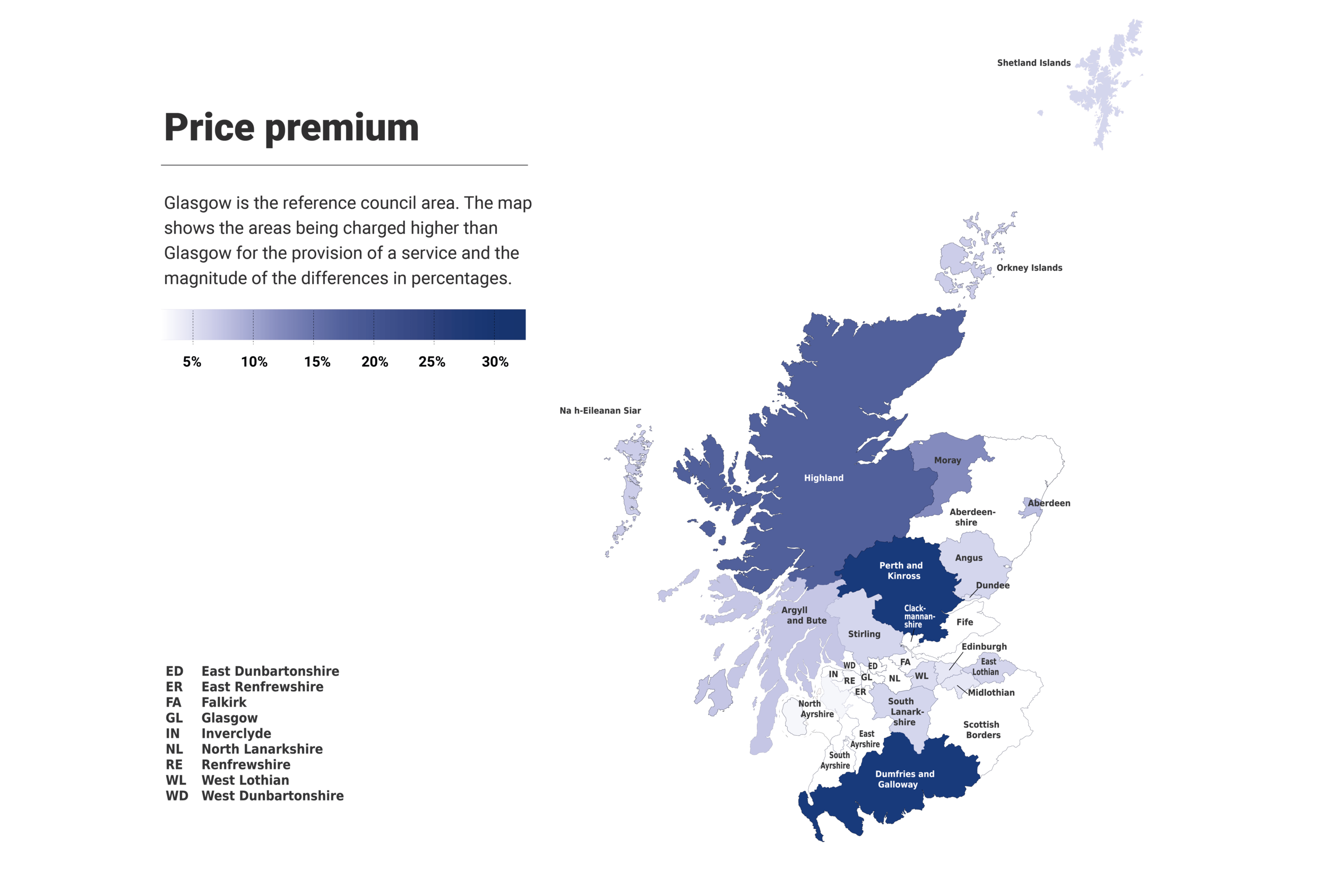
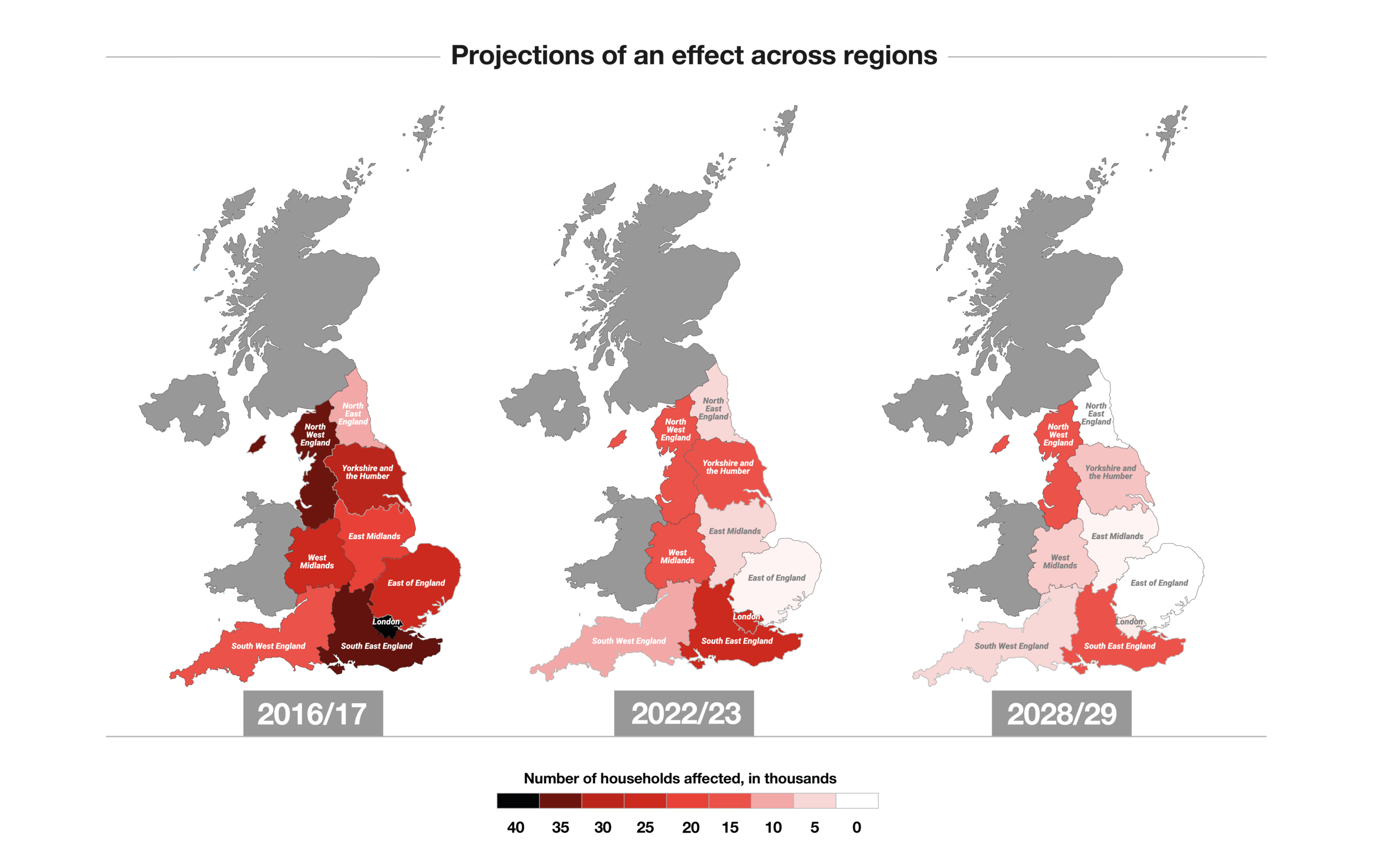
Maps
Geography matters. We create maps to connect our analysis with the people and places affected by specific issues.
Heat maps, cartograms and more highlight geographic disparities at a glance, making them powerful tools to navigate almost any policy issue.
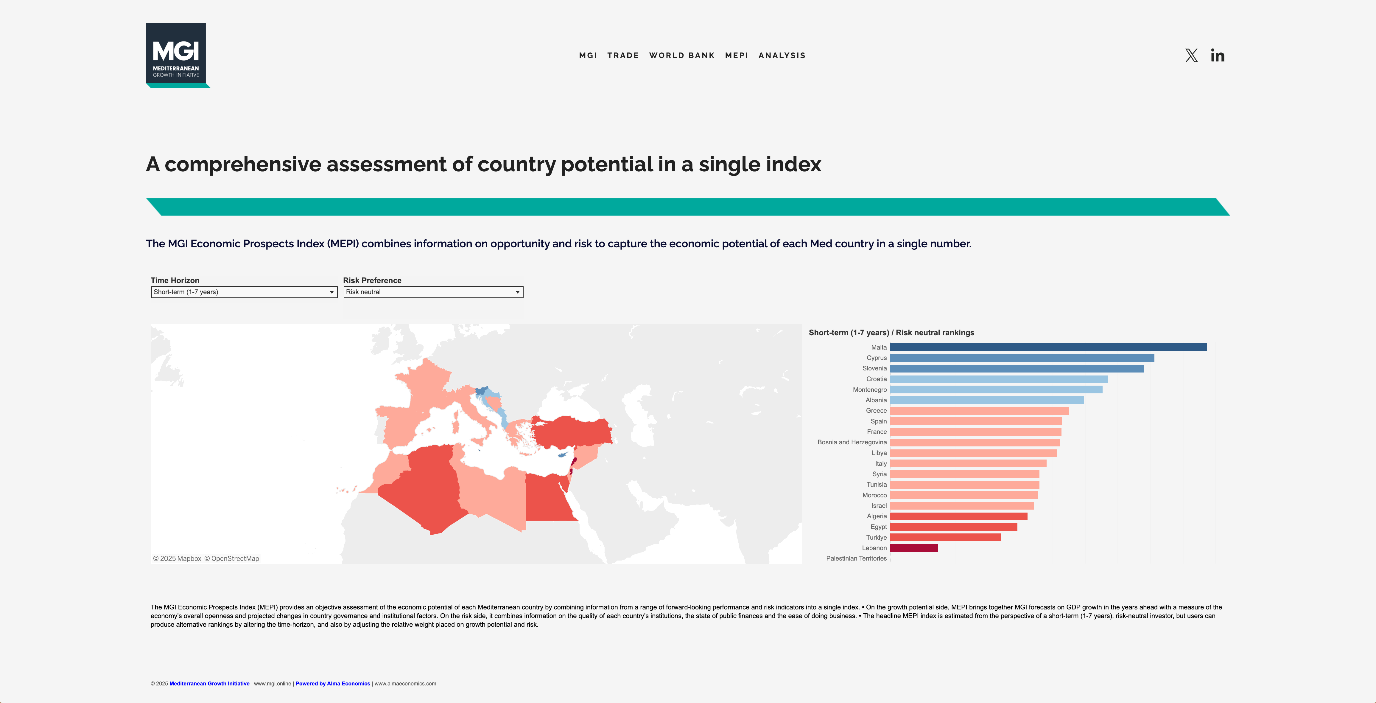
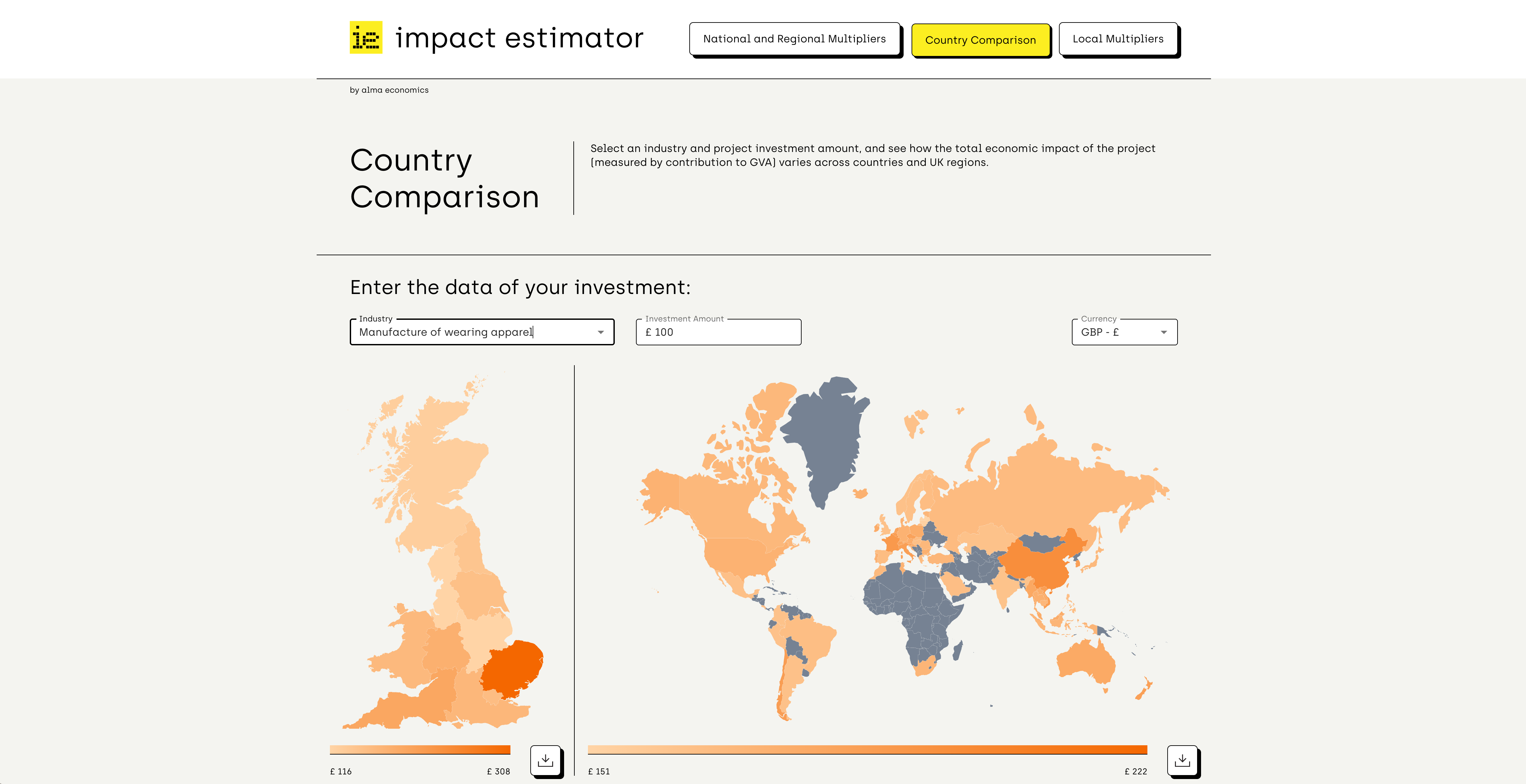
Interactive graphics
The world is anything but static. New information comes up every day, and we constantly adapt to it.
Our interactive visualisation tools enable users to select information for display in various forms and conduct their own analysis on any topic. Data sources can easily be updated, and outcomes tailored to users’ changing needs. This high degree of versatility ensures a lasting impact, even after our work is done.